Fantoons is an award-winning creative studio, passionately crafting words, art and motion into meaningful stories.
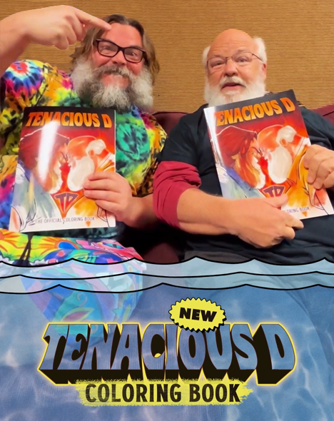
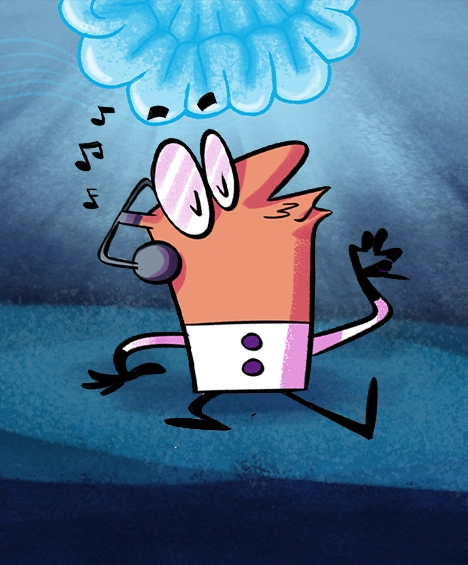
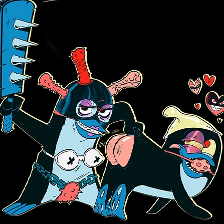
Tenacious D | Coloring Book | Promo
ADVERTISING

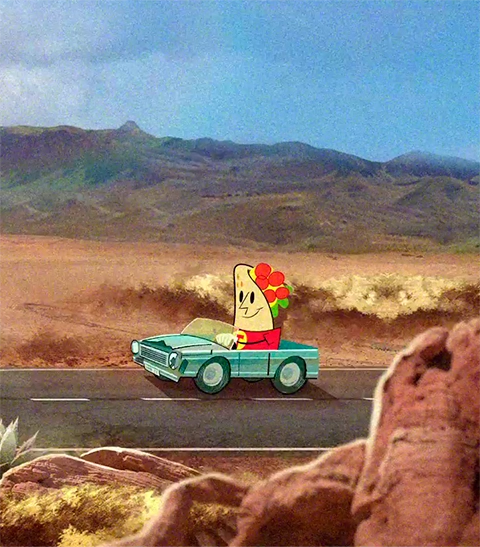
The Odierno Law Firm | Spot
ADVERTISING

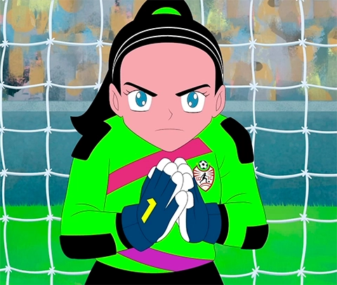
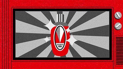
Publicis | Nestlé Leche La Campesina | Spot
ADVERTISING


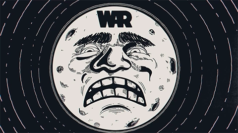
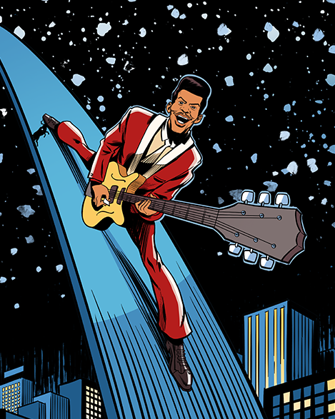
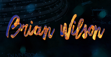
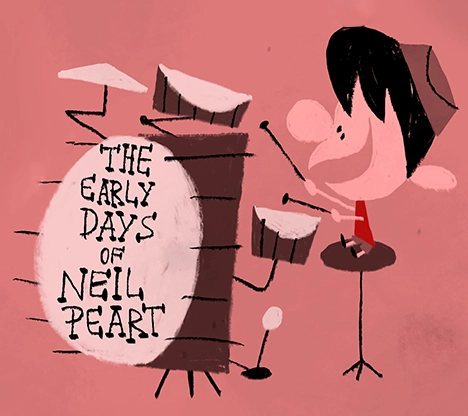
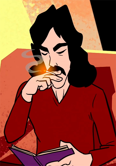
Warner Music |WAR | Behind the Hits | Documentary
ENTERTAINMENT


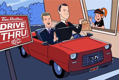
TSN | Jay and Dan Tim Hortons | Spot
ADVERTISING

Maxus | 365 Security | Corporate Video
ADVERTISING


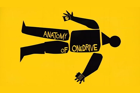
WPP | Office 365 Anywhere | Corporate Video
ADVERTISING